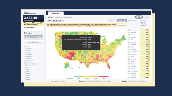
How likely are you to contract COVID-19? That’s a complicated question with a lot of variables. Trying to get insight into your personal risk involves parsing state and county data on rates of infection, hospitalizations, and deaths.
But now there’s a tool that can help you cut through all the noise. Researchers at the Harvard Global Health Institute, in collaboration with a team of scientists, have launched a new interactive map and dashboard that allows you to quickly identify your risk level by state and county. It uses a four-color system, where green represents the lowest level of risk and red represents the highest.
The dashboard is the work of more than a dozen researchers from eight organizations, including Harvard’s Edmond J. Sacra Center for Ethics, CovidActNow, and the Rockefeller Foundation. Tsai says it was important to have a breadth of experiences represented, but also to have a clear, unified approach. “Science by definition is messy,” Tsai says. “There can be a diversity of opinion even among scientists. But what we could agree on is that we need a common language to help guide policymakers.”

While other organizations have developed maps and dashboards to help understand the spread of the virus, what’s notable about this one is that it uses a single metric, which is the number of daily new cases per 100,000 people. This standardizes the numbers and makes it easier to understand the specific risk level in your area. Tsai and his colleagues believe this is more helpful than hearing about the absolute number of new cases in a state or a county. “A thousand new cases in New York is very different from a thousand new cases in Idaho,” says Tsai. “We wanted to create a common metric across the population.”
The researchers have also chosen to represent this information using a visual language—colors—that people will instinctively understand. “There are amber alerts for all kinds of risks, from terrorism to air pollution,” Tsai says. “For COVID, what was lacking was a clear communication around the prevalence of the disease in a particular area.” My colleague Mark Wilson recently pointed out that using colors, rather than text and figures, allows people to process information more easily and can make it easier to remember the information as well.
At the beginning of the pandemic, when the virus first made its way to the United States, it made sense to think about COVID-19 at a national level. But as time has passed, different states have had very different responses and have consequently seen different levels of outbreak. “There’s been a lack of a concerted federal effort against the disease,” Tsai says. “As a result, we’ve seen a patchwork response play out.”
It is now important to assess risk based on your state and county, then respond accordingly. It’s equally important to note how the virus is spreading in adjacent counties. Tsai warns that people living in green or yellow zones shouldn’t feel complacent, because the disease can quickly spread across state and county lines. “If you live in a green area, it doesn’t mean you shouldn’t wear a mask or go back to large gatherings,” he says. “The virus doesn’t respect any boundaries. ”
No comments:
Post a Comment
Note: Only a member of this blog may post a comment.