For weeks now we’ve been hearing that testing for COVID-19 is the key to stopping the spread of the novel coronavirus (SARS-CoV2) that causes the disease, and we’ve also been told repeatedly that the United States as a whole has been woefully slow to test potentially infected people.
Because each state’s Department of Health is largely responsible for managing its own testing regime, the response to the pandemic has varied widely from state to state.
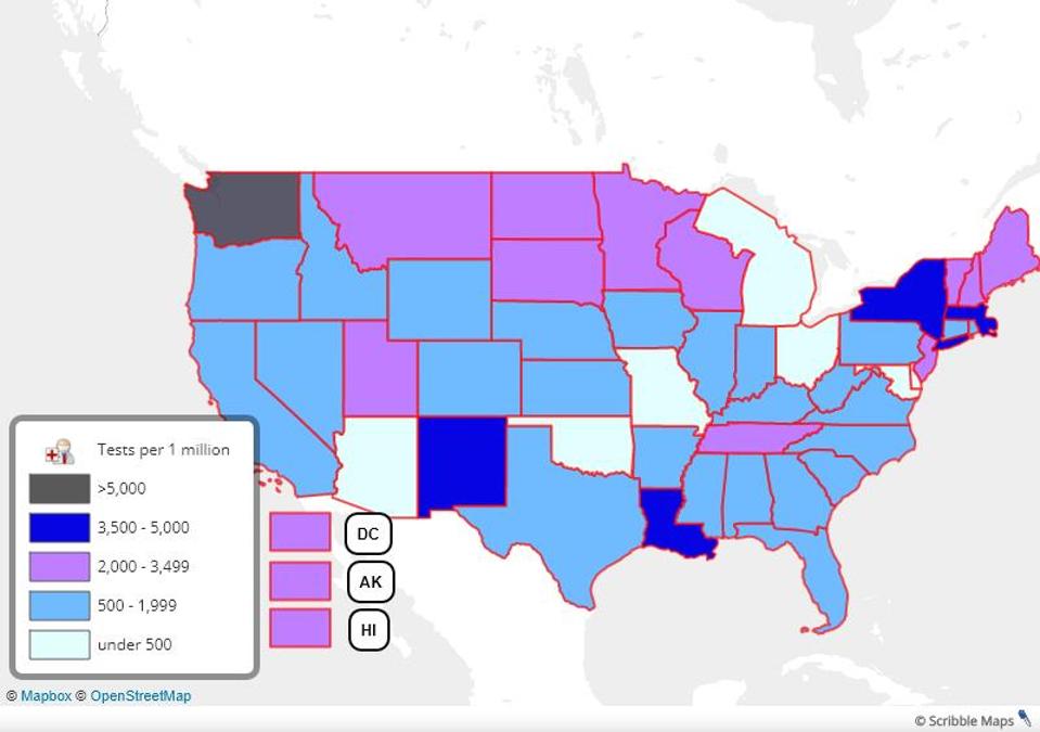
Computer scientist Danny Yang and his site, Coronavirus API Public Health Initiative, pull in publicly available data from each state and also break down how much official testing has been done per 1 million people of population, essentially giving per capita testing figures.
I took that data and put it on a zoomable map to make it easier to digest visually, but you can also find the state per capita testing data, in ranked order, at the end of this post.
While Washington is the first state to test over a half of one percent of its total population, New York, Massachusetts and Louisiana are close behind as they race to fight their own outbreaks.
It’s important to note that much of the data coming out of the coronavirus pandemic is incomplete and probably doesn’t tell the whole story. A number of states report lag time in getting results back from hospitals and private laboratories that may be getting crushed by the work load.
Other states, like Maryland and Ohio, don’t have complete data sets that show both the number of positive tests and total tests administered.
The pandemic is a fluid situation that’s changing quickly. Unfortunately, much of the information helping us to understand it is too. I will work to keep this post and the map updated as the data (hopefully) improves.
https://www.forbes.com/sites/ericmack/2020/03/26/see-how-much-coronavirus-testing-is-happening-in-each-state/#6b41e3535751
No comments:
Post a Comment
Note: Only a member of this blog may post a comment.