How design can stop the spread of the Wuhan coronovirus
When airports are screening passengers for a communicable disease,
you know it’s serious. No one wants another H1N1. As of this writing,
the Wuhan China outbreak of coronavirus has infected more than 800,
killed 41 people, and found its way to the United States in two
confirmed cases. No doubt tomorrow’s news will broadcast even larger
numbers. Public health officials are still working to figure out exactly
how the coronavirus is spreading, but they are clear on one point: It
needs to be contained. Data visualization can help them do that.
From a public health perspective, containment and, eventually,
eradication are always the goals for communicable diseases. Smart public
health officials understand that containment requires educating the
public about how diseases spread, with an urgency that gets folks to pay
attention.
But traditionally, public health officials have focused their
communication efforts at other public health officials and when nerds
talk to nerds they use nerd-speak. Which means communication looks
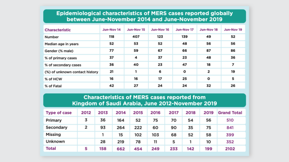
something like this: [Image: WHO]
Which is from a World Health Organization report
on a strain of coronavirus. A table of numbers doesn’t inspire much
action among the public because tables are dense, our brains don’t
process them well, and nothing meaningful pops out.Enter data
visualization. Graphics can teach people where diseases are, how they
spread, and how to stop the outbreak. I know because I am a data visualization nerd,
and I teach people how to communicate their data more effectively. I
have worked with public health agencies from Alaska to Florida, from
community health departments to our national Centers for Disease Control
and Prevention, to help them improve their visuals (and, as a result,
save some lives).
Though public health officials have been knee deep in data for
decades, visualizing it effectively is still a work in progress. It’s
more important than ever for public health agencies to use data
visualization to communicate with the masses, as the public is bombarded
with more information each day and in need of a way for the most
pressing issues to cut through the noise. Here are three ways data
visualization and design are helping public health officials stop the
spread of infectious diseases.
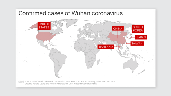
The What/Where Stage
The first stage of visualizing communicable disease data is typically
to show where the disease has been identified on a map. This is the
What/Where stage – what is happening and where. CNN recently showed this map of the coronavirus.
[Image: CNN]
The simple visual aid of the color red in the United States will get
some Americans to perk up and pay attention. This isn’t something just
happening in Wuhan.
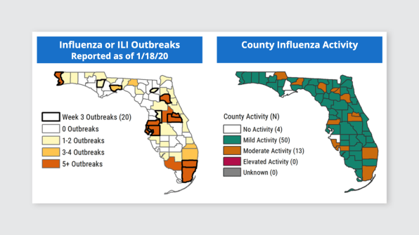
Many states, including Florida, use a similar visual to plot out where more common viruses, like flu, are located: [Image: Florida Department of Health]
It is definitely important to know where activity is present. But
just knowing what a virus is and where it is infecting people isn’t
going to stop it’s spread. Public health officials can actually move the
public to a deeper understanding by creating graphics that answer more
intense questions.
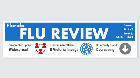
The So What Stage
The So What stage of visualizing communicable diseases requires
public health officials to tell a bit of a story with their data.
The very top of Florida’s weekly flu review includes So What information: [Image: Florida Department of Health]
They use icons to indicate that, though the flu virus is widespread, it is decreasing. Helpful info.
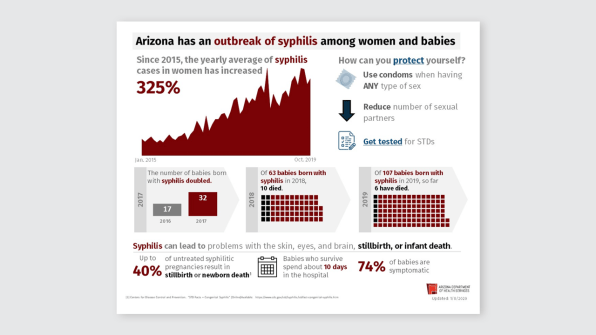
Arizona Department of Health
addressed So What in their reporting on syphilis by including
historical data in a red area graph pointing to a substantial increase
and using black squares in their icon arrays to tell a story about
deaths among babies born with the communicable disease. Ugh, it hurt my
heart just to write that sentence. Yes, data visualization can do that. [Image: Arizona Department of Health Services]
And while the visuals might not be as sophisticated as those from The New York Times,
this isn’t a moment when an interactive, exploratory,
so-beautiful-it-is-almost-art design makes sense. We need something
quick and easy-to-understand by folks who range in ages, abilities, and
languages.
The So What stage is where public health officials lay out the
consequences of the disease, to communicate to the public the urgency of
the situation and make them feel some emotion. Now folks are paying
attention. This is exact when public health officials swoop in with a
visual for the next stage, which aims directly at containment and
eradication.
The Now What Stage
Once public health officials give the data meaning, the public is
likely to understand the significance and scope of the problem. They are
ready to take action. They are asking, “Now what?”
The Now What stage of visualizing communicable disease data is where
public health officials have the chance to educate a worried
constituency on the exact actions that need to be taken to safeguard
ourselves and each other. Arizona answered “Now what?” in the graphic
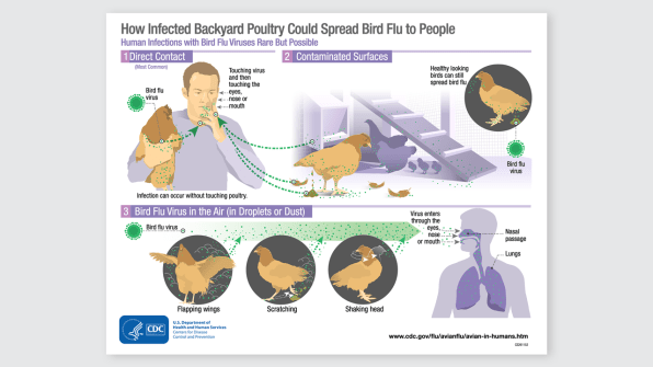
above in their “How can you protect yourself?” section. Centers for Disease Control and Prevention
has been making strides to speak to “Now what?” by translating their
depth of health knowledge through educational infographics, like how
bird flu can spread to humans.
[Image: CDC]
What had traditionally been communicated in paragraphs of text, which
followed a dense statistical table, is now an illustrated poster that
can hang in a clinic waiting room.
With something as globally threatening as the Wuhan coronavirus, we
need to take action quickly. Public health officials should take note of
successful data visualization and designs used in other awareness
campaigns. And we, the public, should ask for the data, presented with
clear messaging and strong visuals. Particularly in an age where some
real news is labeled as fake and some fake news looks all too real, the
more we ask What? So What? and Now What? from our news sources, the more
we can do our part to contain and eradicate before an outbreak becomes
widespread. https://www.fastcompany.com/90455933/how-design-can-stop-the-spread-of-the-wuhan-coronovirus
No comments:
Post a Comment
Note: Only a member of this blog may post a comment.
No comments:
Post a Comment
Note: Only a member of this blog may post a comment.